Description
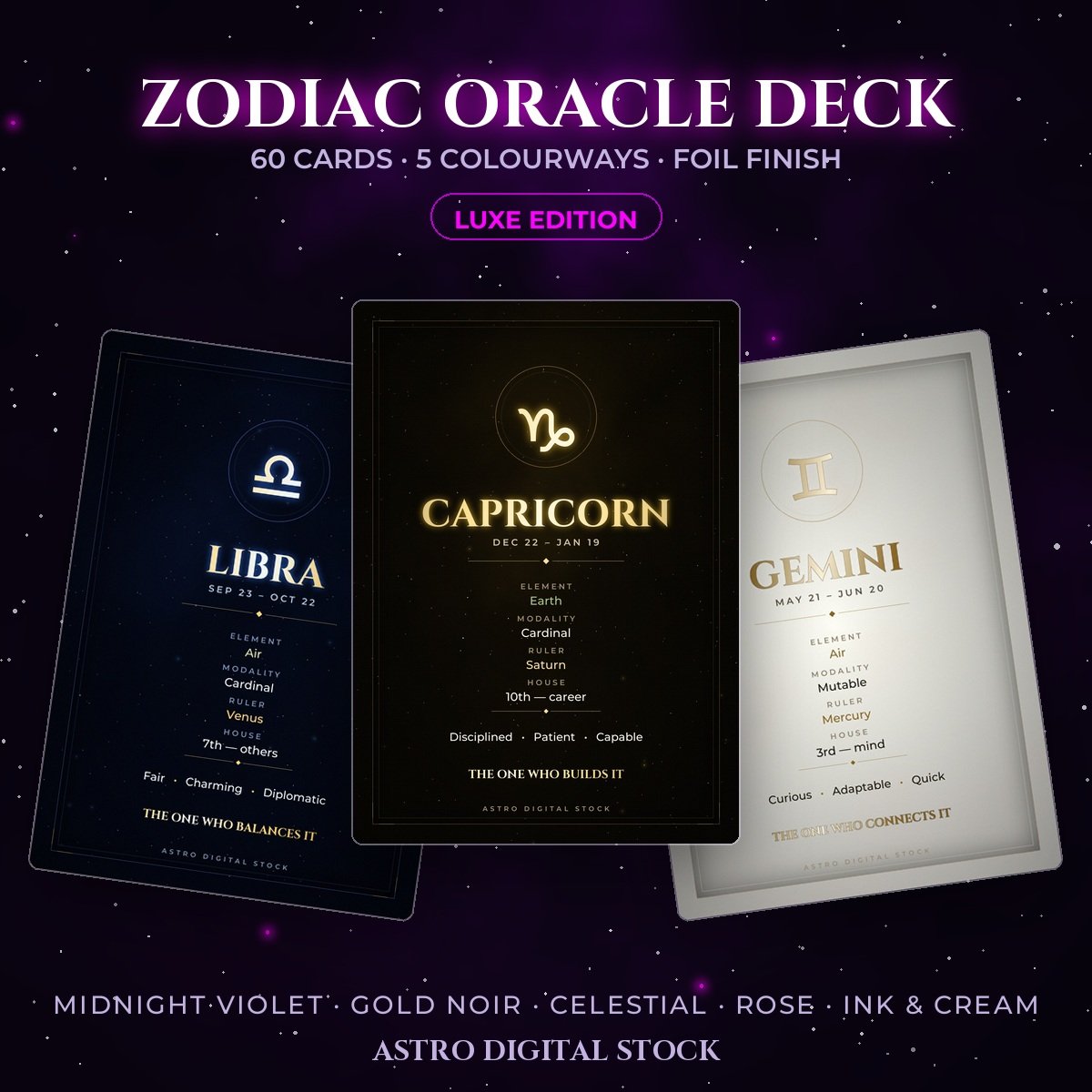
Sixty cards. Twelve signs, five colourways, at the proportion of a printed tarot card — and finished the way a printed deck is finished, not the way a graphic is exported.
What makes it look expensive
- Real foil, not gold-coloured text. Every title and glyph is filled with a metal gradient that runs across the letterform, with a specular band where the light catches. Flat gold fill is the thing that gives cheap templates away.
- A double hairline frame with corner ornament — one-pixel rules, the way print does it, not a four-pixel stroke.
- Rules broken by a diamond, letterspaced small caps, and an inner shadow so the card sits in the page.
- A woven surface tooth. Perfectly flat colour is the tell; paper and cloth are never flat.
Five colourways
- Midnight Violet — the house palette
- Gold Noir — warm metal on black
- Celestial Blue — cold steel on deep navy
- Rose Quartz — soft rose on plum
- Ink & Cream — gold foil on cream, built light-first rather than inverted
Each carries its own harmonised element colours, so nothing shouts against the palette it sits in.
Specification
- 1600 × 2240 px, 5:7 — prints at 300dpi to 5.3 × 7.5 inches
- 60 JPEG files, organised by colourway
- Text contrast checked against WCAG on every colourway, including the light one
Made from scratch
Every graphic, page and frame in this product was generated for it. Nothing is stock photography, nothing came off the internet, and nothing is shared with another seller’s pack.
Format: high-quality JPG, instant download. Commercial license included.
Members download this free with any membership.

Reviews
There are no reviews yet.