Audiences judge credibility visually before they read a word — and inconsistent, improvised graphics whisper “hobbyist” no matter how good the astrology is. You don’t need a designer. You need a system inside Canva: one brand kit, three mastered templates, and a naming discipline. Total setup: one afternoon. Payoff: every post afterward.
Step 1 — the brand kit (once)
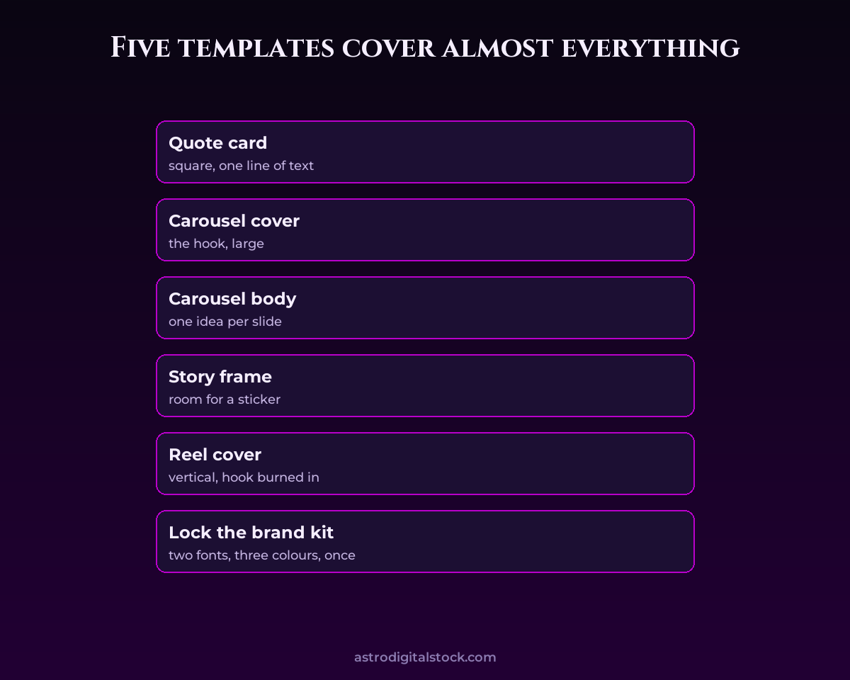
Set your colours (2 base + 1–2 accents — think deep cosmic tones with one neon signature), two fonts maximum (a display font for titles, a clean sans for body), and your logo. From now on, every design pulls from the kit — this single constraint is 80% of looking professional, because consistency reads as intention.
Step 2 — master three templates (not thirty)
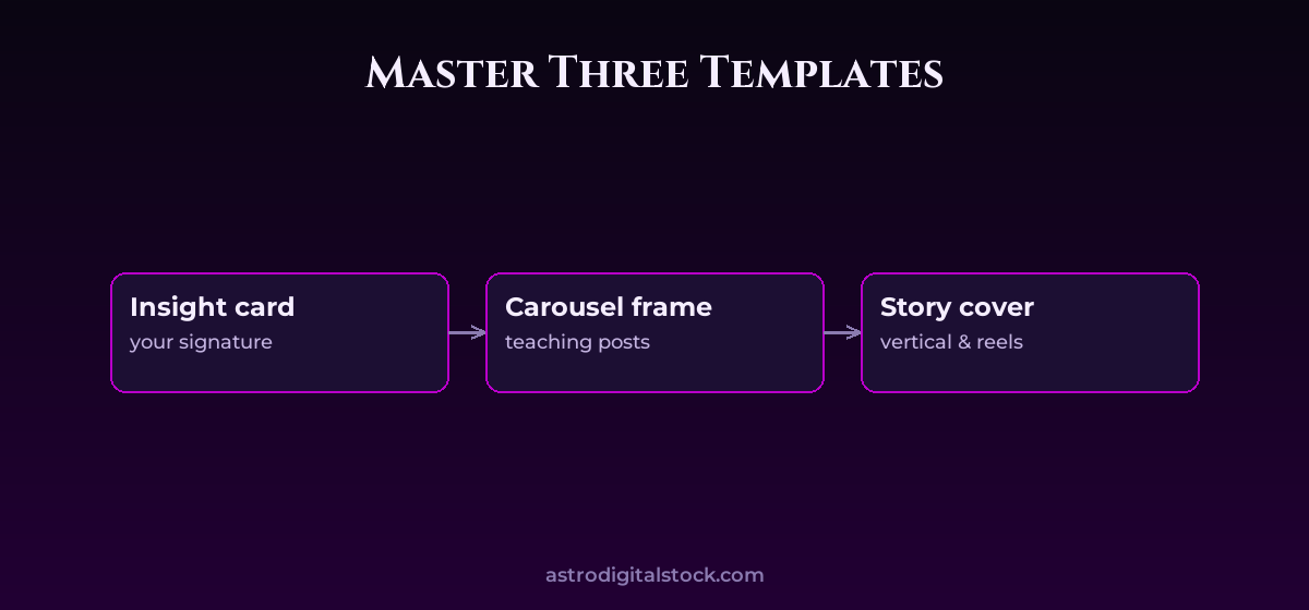
- The quote/insight card: your most-used format — one strong line on a branded background. Make it recognisable at thumbnail size; this card becomes your visual signature in feeds and shares.
- The carousel frame: title slide + content slide + CTA slide, with fixed positions for headings and text. Ten-slide teaching posts become fill-in-the-blanks.
- The story/reel cover: vertical frame for announcements, story series and reel title cards.
Duplicate-and-edit is the entire workflow: never design from zero again. Resist template hoarding — three formats used consistently beat thirty used once.
Step 3 — batch and name like a professional
- During your batch day (see the Batch Day lesson), open a template and produce ALL of the month’s graphics in one run — same mental mode, massive speed gains.
- Name files by date and topic (“2026-08-full-moon-carousel”), in monthly folders. Future-you searching for “that Mars graphic” will send thanks.
- Export in the right sizes from the start: square and vertical variants per piece, so cross-posting never means re-designing.
The premium details most people skip
- Whitespace is luxury: when in doubt, remove one element and enlarge the margins.
- One accent per design: the neon signature colour works BECAUSE it’s rationed.
- Real assets beat clip-art: premium illustration packs (like the ones in the Astro Digital Stock library) instantly out-class generic star doodles — drop them into your templates and the whole feed levels up.
Try it yourself
This week: build the brand kit, then recreate your three most common post types as templates. Next batch day, time yourself — most creators cut visual production from hours to under thirty minutes.
Worked example: from two hours to twenty minutes
Keep reading this lesson
This lesson is part of the Astro Digital Stock Learning Zone — available to members. Join to read every lesson, download the full asset library, and use our live content tools.
- Every astrology, marketing & promotion lesson
- The complete digital asset library
- Live social-media trend tools
- New drops every month